
Editorial and publication design · 2024
Graphic DesignMilestones: Women in Sport
An editorial publication tracing progress, power and the barriers that continue to shape women’s experience of sport.
- Disciplines
- Editorial design
Publication design
Research - Role
- Research, editorial direction and complete design
- Outcome
- Independent publication with a four-page fold-out timeline
An independent academic response to the ISTD Student Assessment Scheme “Milestones” brief. The project was not commissioned or selected by ISTD.
Context and challenge
A broad brief, redirected towards a story that matters to me.
The original Milestones brief was adapted to explore an industry and issue I care about. The publication examines women’s changing place in sport: the progress already made, the people who advanced it and the inequalities that remain.
The challenge was to hold historical research, data, personal testimony and visual provocation within one clear editorial narrative—without reducing a complex subject to a list of achievements.
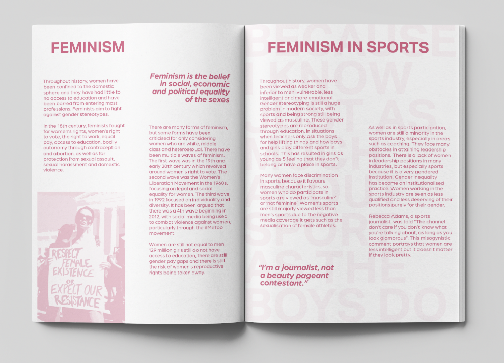
Feminism and history
Progress understood through participation, resistance and change.
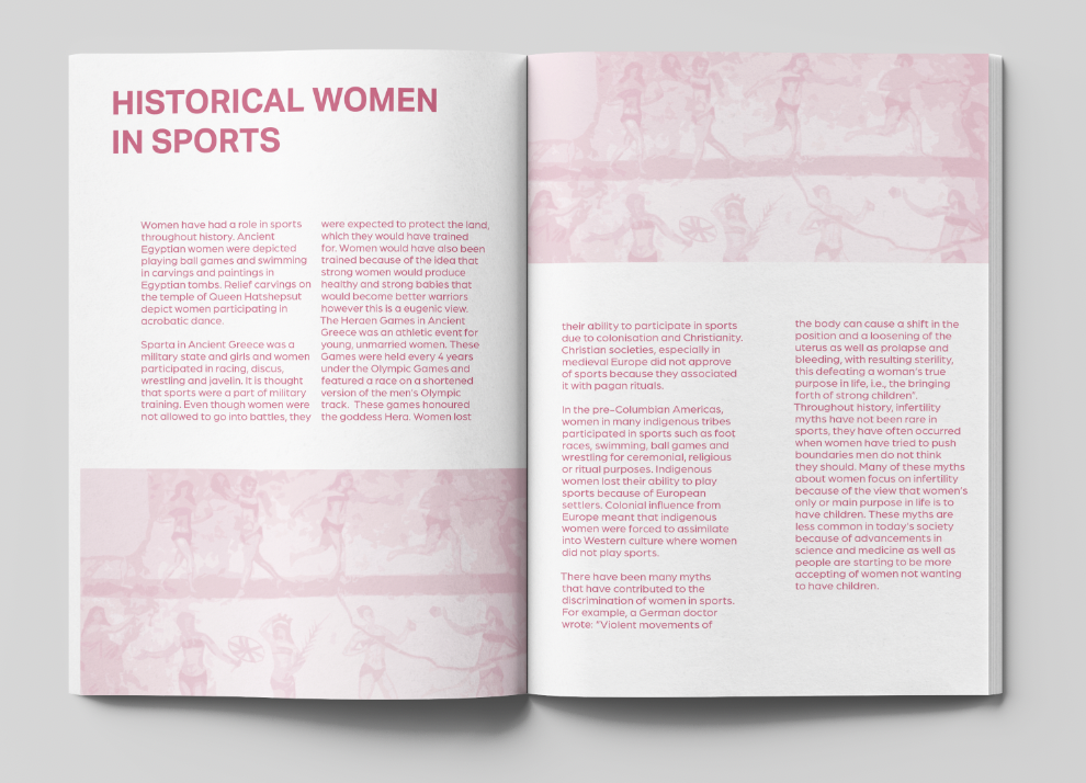
Research began with feminism and the history of women’s participation in sport. It considers who was permitted to compete, how expectations shifted and how sporting milestones sit within a wider movement towards equality.
The opening sequence establishes that progress has never been linear. Achievement is set against exclusion, stereotypes and structures that have repeatedly limited women’s opportunities.
Editorial narrative
Research shaped into a story of visibility and voice.
The publication moves between contextual writing, archival material, data, athlete profiles and first-hand experience. This layered structure connects public milestones with the less visible realities behind them.
Rather than treating history and the present as separate subjects, recurring themes—representation, body image, inequality and access—link each section and show how earlier attitudes continue to influence modern sport.
Advertising and participation
Public messages placed beside measurable change.
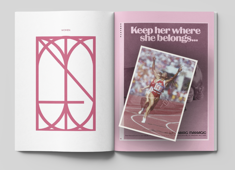
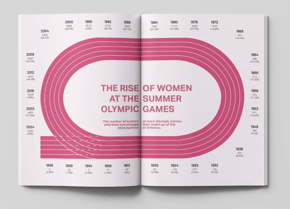
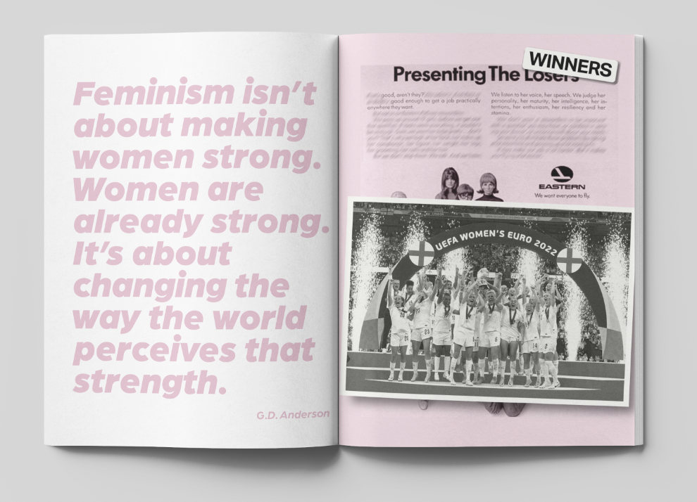
A reworked historical advertisement introduces the publication’s critique of sexist messaging before Olympic participation data gives scale to women’s changing visibility in sport.
Placing provocation beside evidence allows the editorial story to move between cultural attitudes and the progress recorded through participation.
Colour and visual system
Pink reclaimed as a colour of strength.
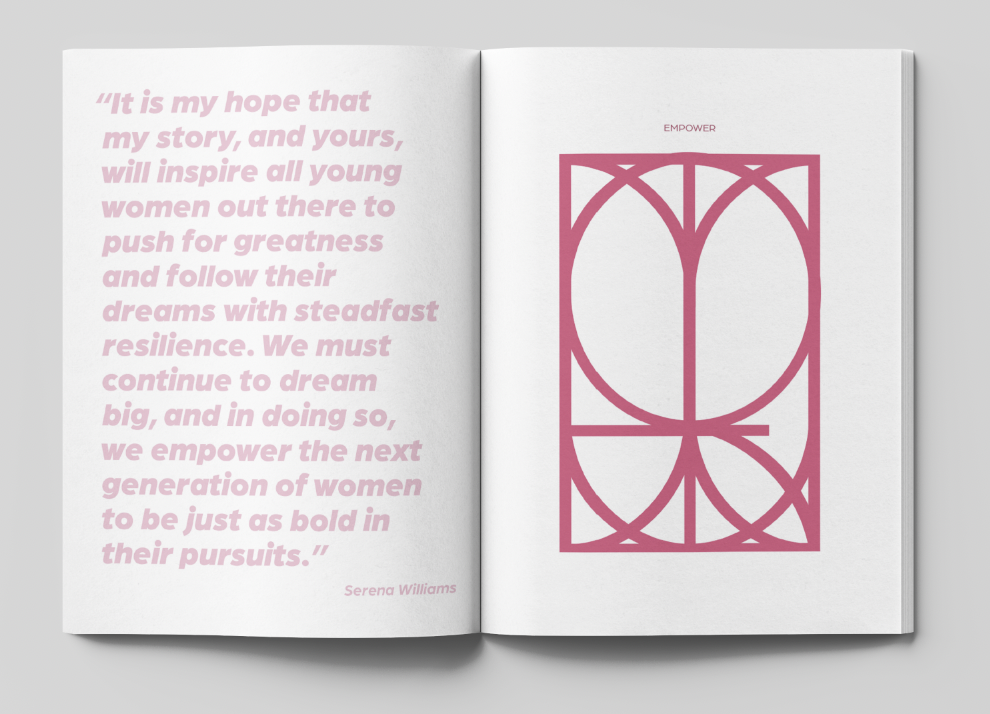
Pink is used deliberately and assertively, challenging the assumption that femininity, strength and athletic ability are incompatible. It becomes a unifying editorial device rather than a passive or decorative accent.
Bold scale, structured pacing and recurring graphic forms move the reader between evidence, reflection and confrontation while keeping the publication visually connected.
Towards the timeline
Achievement and lived experience lead into history.
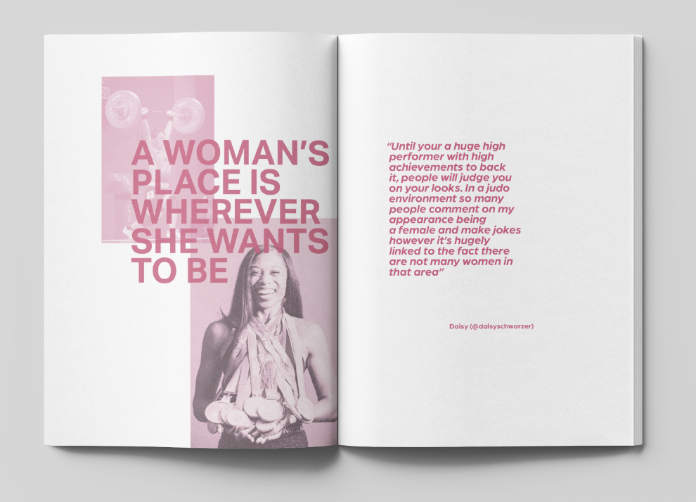
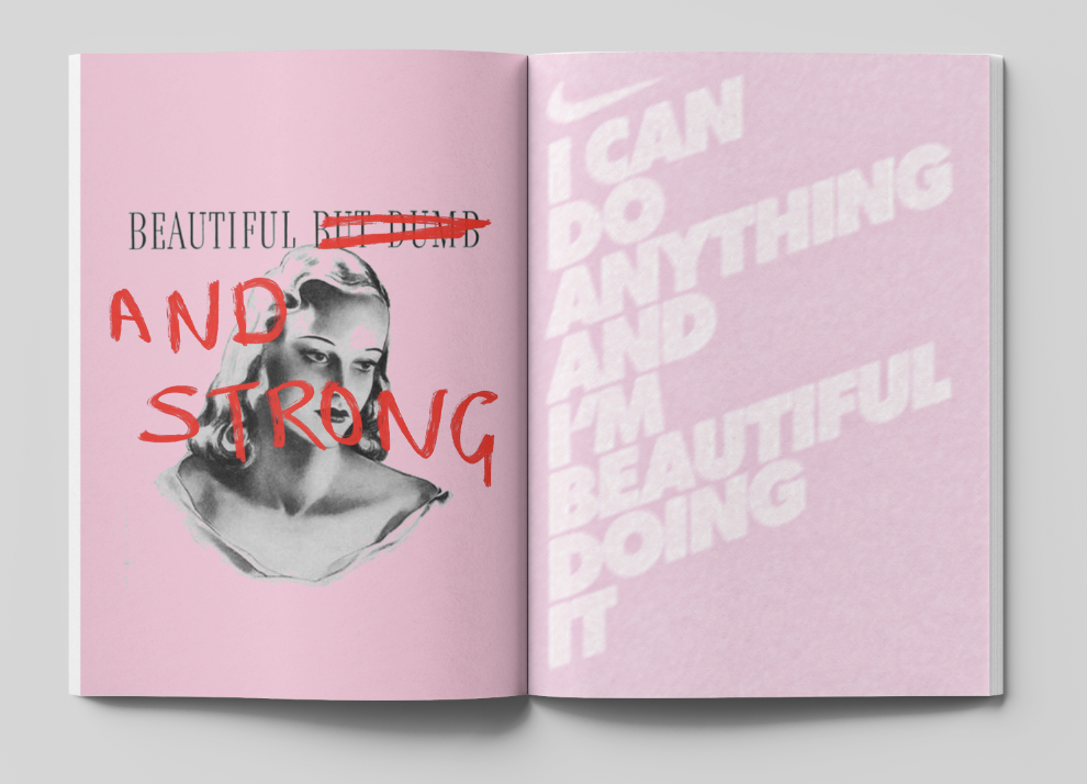
The sequence moves from an assertive reworking of “winners” to a first-hand voice, then introduces the extended timeline at the centre of the publication.
The fold-out timeline
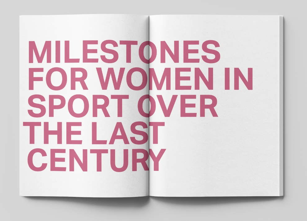
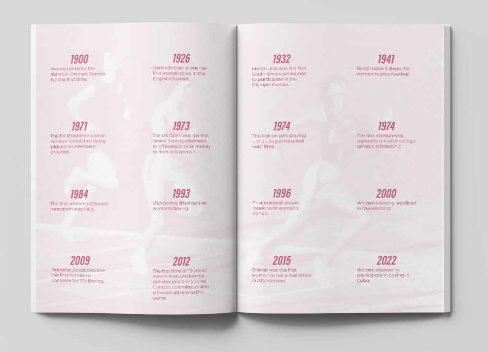
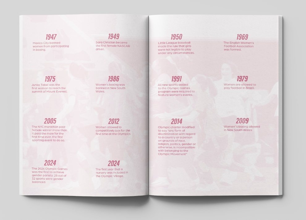
One central spread expands into four pages of history.
A central spread physically unfolds to reveal a four-page timeline of significant moments. A screen cannot reproduce the fold itself, so the two images below are presented together to show the complete extended timeline.
Influential athletes
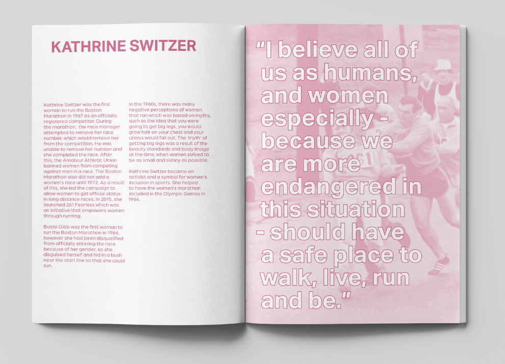
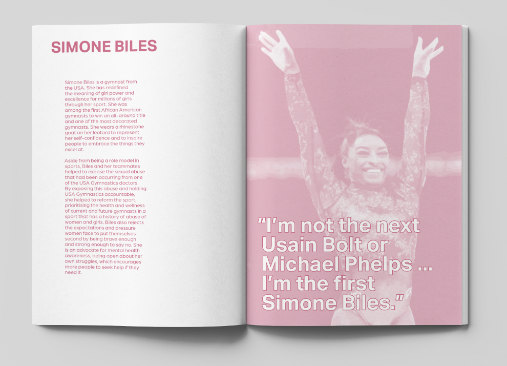
Three careers that changed what could be seen and imagined.
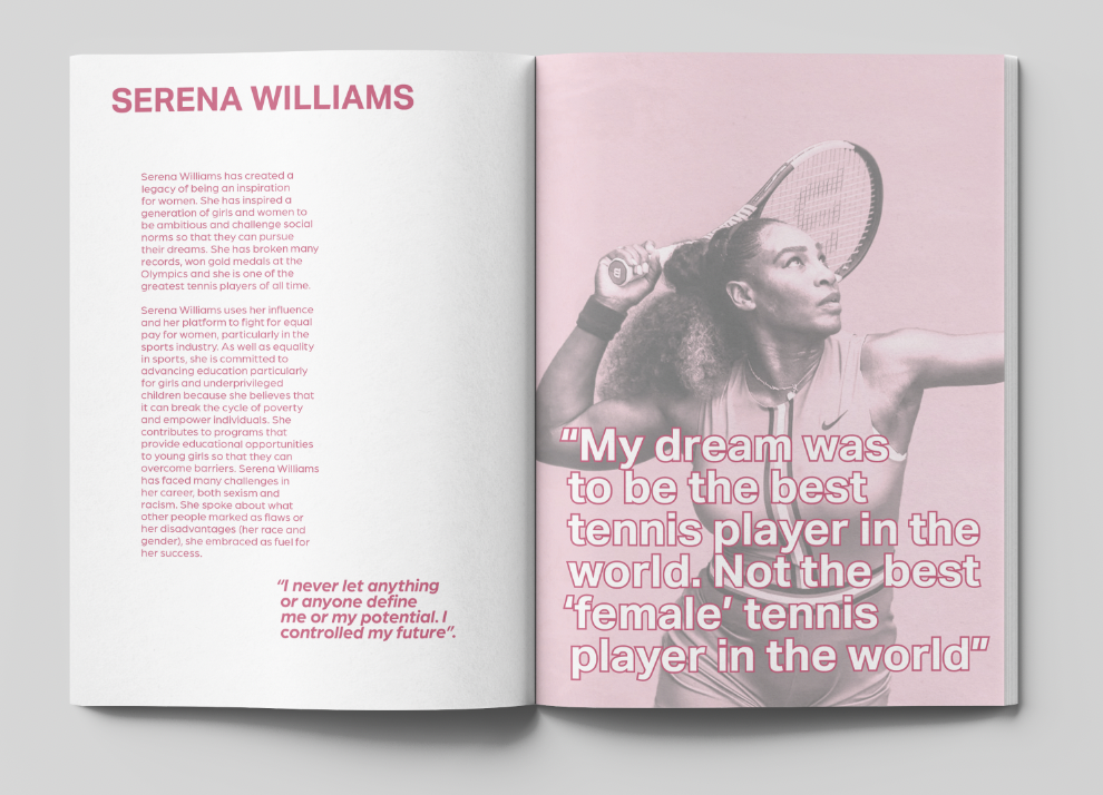
Profiles of Simone Biles, Serena Williams and Kathrine Switzer connect the publication’s themes to individual lives. Together they introduce different forms of influence: sporting excellence, visibility, resistance and the power to challenge expectations.
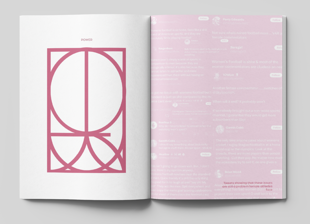
Continuing barriers
Progress set against the problems that remain.
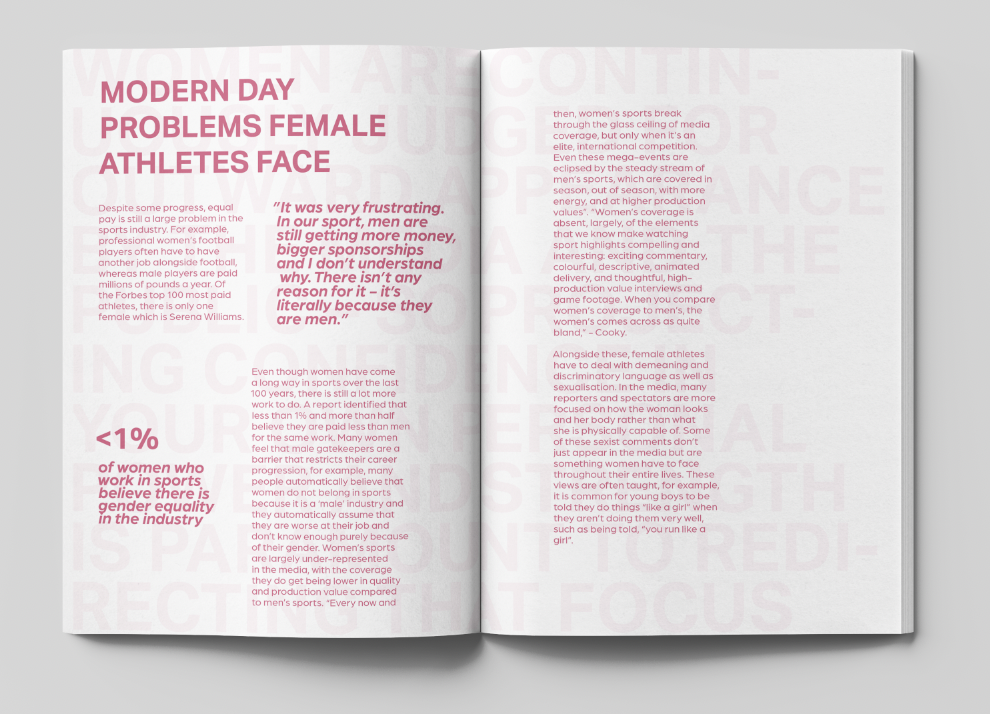
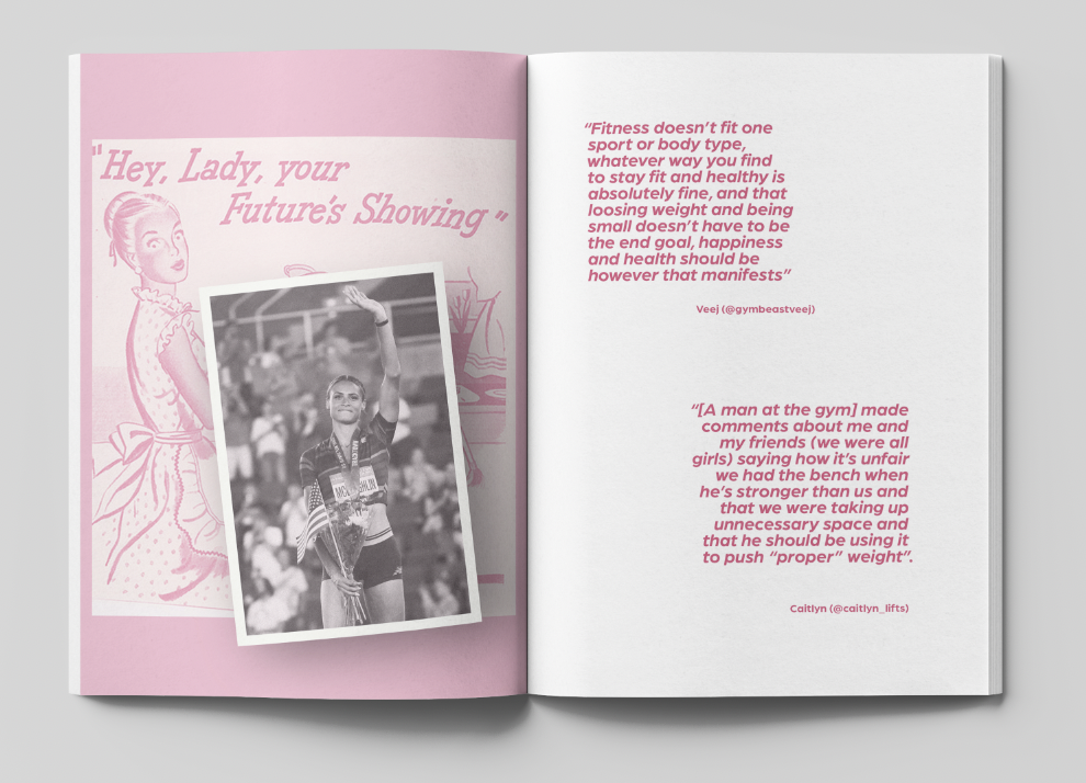
Modern barriers sit alongside historical advertisements edited to confront their sexist messages. Their altered language exposes the assumptions behind the originals and turns familiar advertising techniques back on themselves.
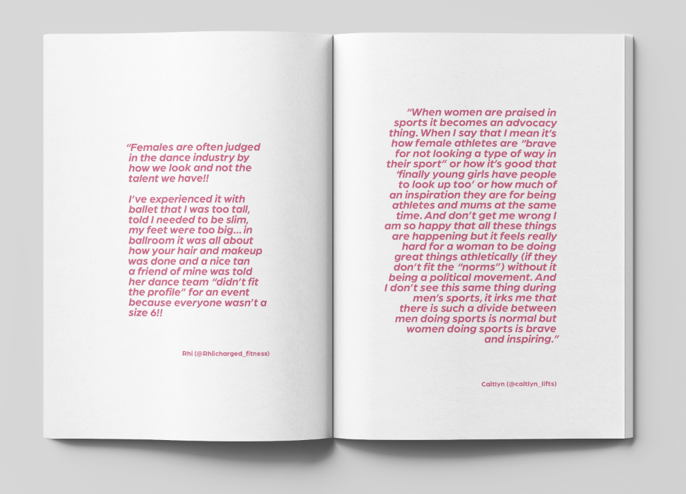
Participant quotations return the argument to first-hand experience, connecting representation, body image and inequality to the people who encounter them.
Custom letterforms
Language built from movement and connection.
Custom decorative letterforms were developed around words including Women, Feminism, Power and Empower. Curves, circles and lines reference tracks, courts, movement and connection, giving the publication its own thematic visual language.
Reflection
Form and editorial argument developed together.
The project strengthened my ability to turn broad research into a focused publication with a clear point of view. Balancing factual material with first-hand voices helped the subject remain human, while the fold-out timeline created a physical moment that could only exist through print.
The finished work shows how editorial design can question inherited visual language, not simply organise information. Reclaiming pink, building thematic letterforms and altering historical advertisements allowed the design itself to take a position.
Credits
Research, editorial direction and complete publication design by Gem Backhouse.
Created as an independent academic response to the ISTD Student Assessment Scheme “Milestones” brief. It was not commissioned or selected by ISTD.
Historical advertisements and third-party imagery are recontextualised within this academic project and remain the property of their respective owners.