
Brand Identity · 2025
Graphic DesignA Legacy in the Making
Brand identity and a conceptual reveal experience for F4 driver Rowan Campbell-Pilling.
- Disciplines
- Brand identity
Editorial design
Creative direction - Role
- Research, concept, direction and design
- Deliverables
- Identity, driver cards, brand book, merchandise and conceptual reveal experience
Developed in response to a university live brief created with Rowan Campbell-Pilling and his team. The final direction was independently designed and was not selected or adopted as Rowan’s official identity. The reveal event, spatial design and related applications are conceptual.
The context
A driver building a story beyond the circuit.
The project began as a university live brief developed in collaboration with Rowan and his team. Meetings, presentations and visits offered insight into his racing career, ambitions and connection to Sheffield. The opportunity was to create an identity that could distinguish him from other emerging drivers and communicate his aspiration to reach Formula 1.
Rather than following motorsport’s familiar language of speed, aggression and high-energy graphics, the brief was reframed around heritage, prestige and the idea of a legacy still being formed.
Research and idea
Motorsport heritage, seen through Sheffield craftsmanship.
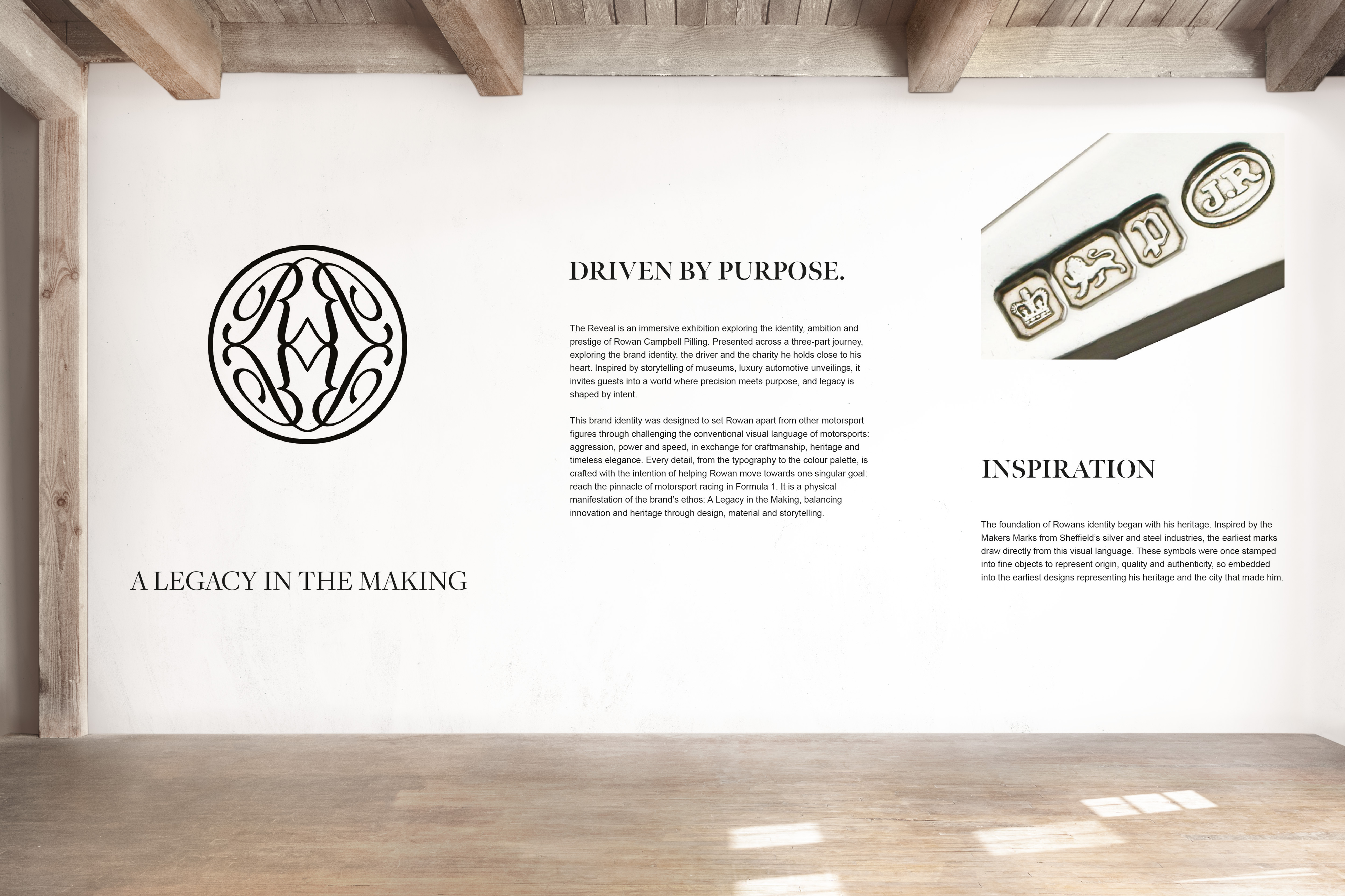
Research moved between motorsport history, luxury brands, editorial design, automotive unveilings and Sheffield’s tradition of makers’ marks. These marks became an important link between Rowan’s birthplace and an identity intended to communicate origin, quality and permanence.
The central idea brings together the heritage and prestige of motorsport with Rowan’s own developing story. Legacy is treated as something built through ambition, purpose and the ability to inspire others.
The identity
A refined mark designed to carry a sense of permanence.
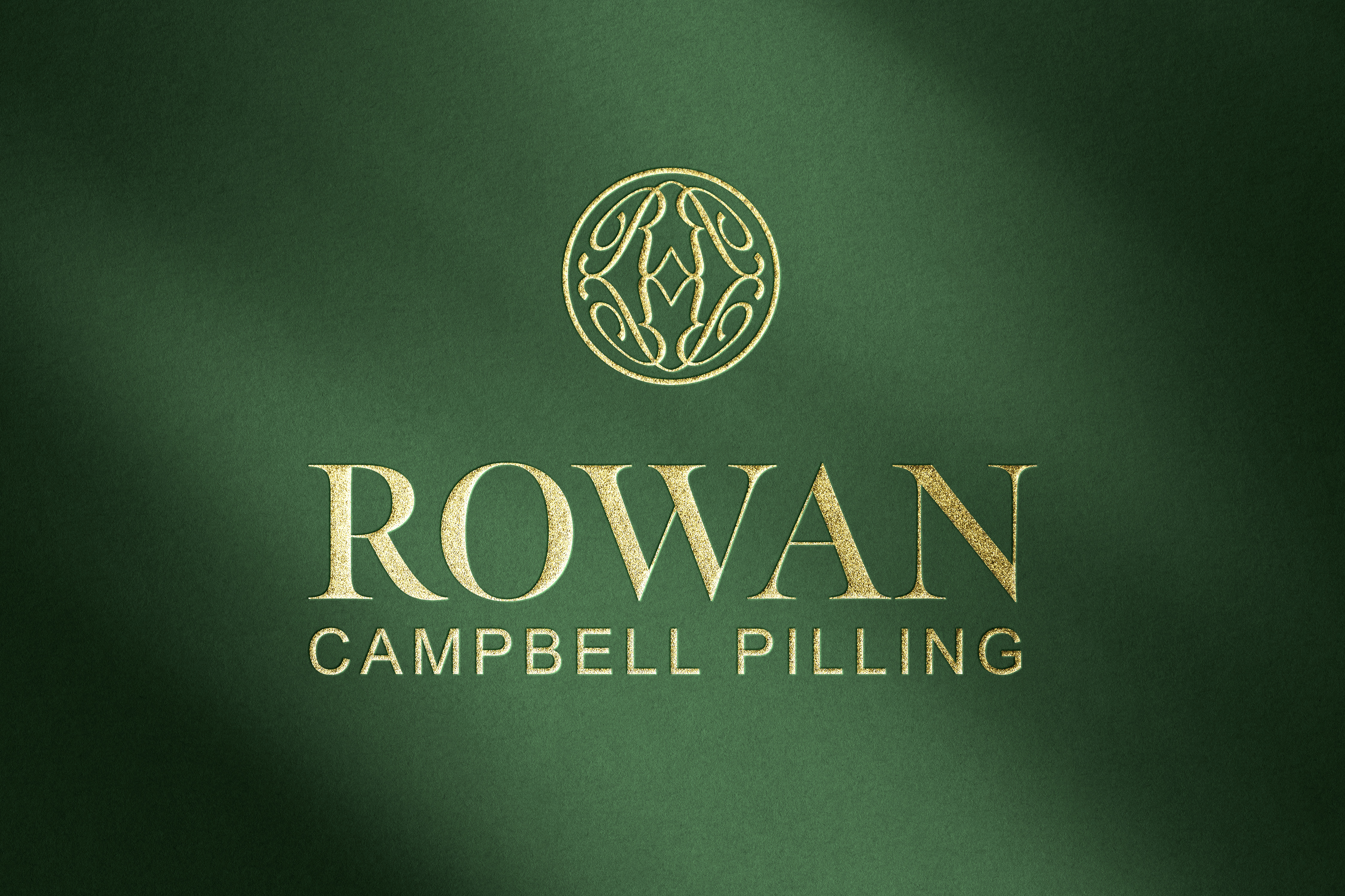
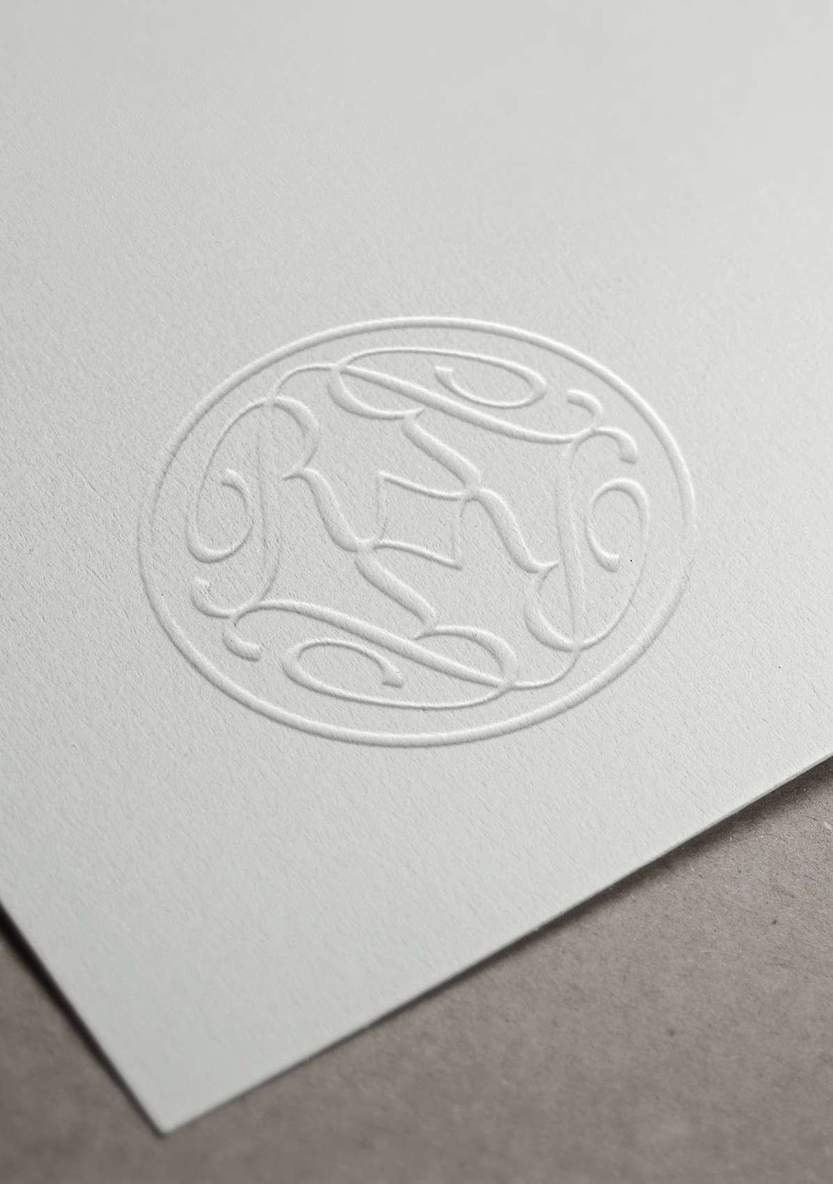
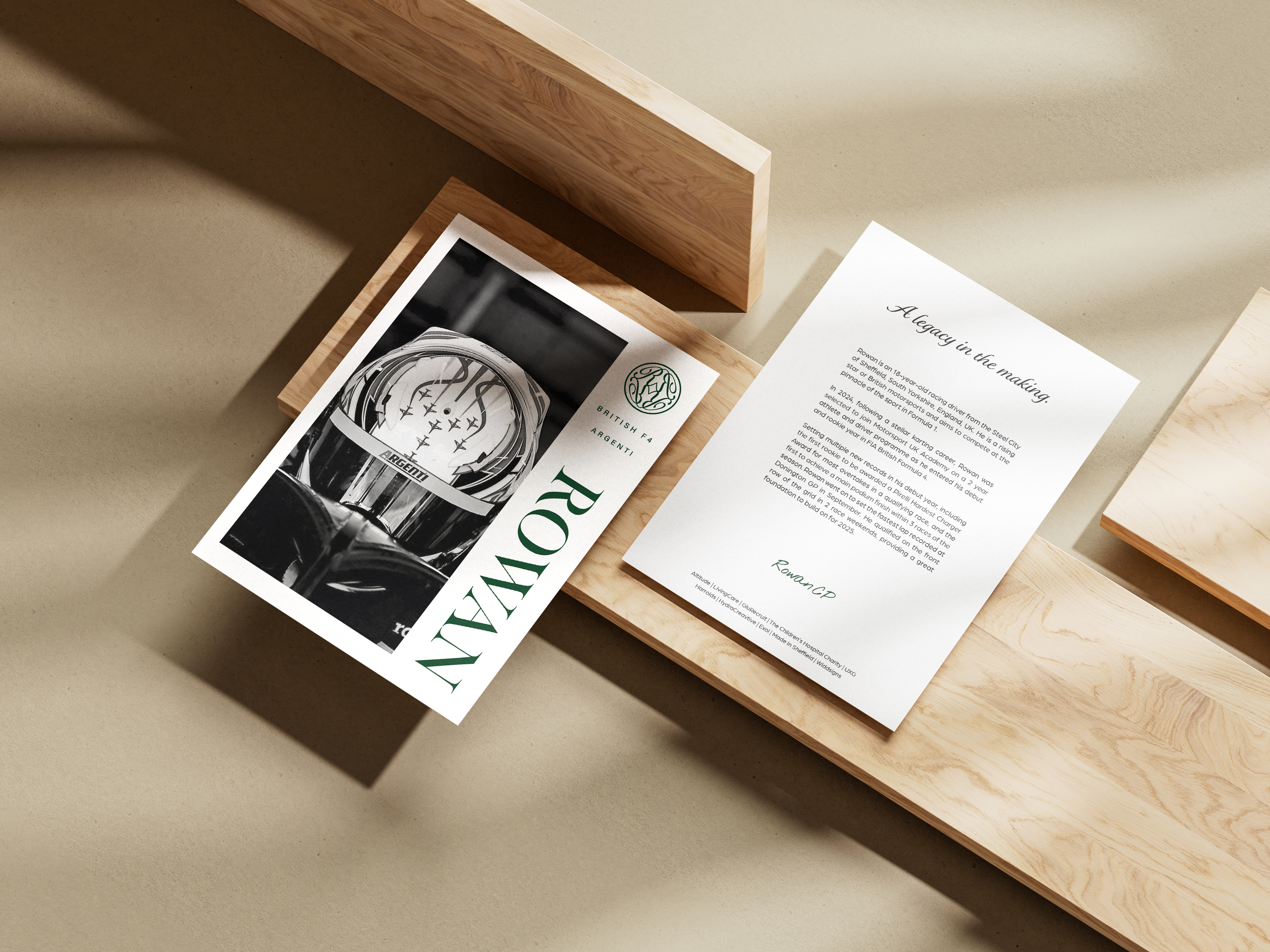
The identity centres on an ornate R monogram held within a circular emblem. Its stamp-like construction references Sheffield makers’ marks, while the circular form offers a subtle connection to the wheel. A refined wordmark and a combination of serif and spaced sans-serif typography balance tradition with a contemporary clarity.
British racing green, off-black and off-white establish the core palette, with gold used in selected presentations to heighten the sense of ceremony and craftsmanship. Generous white space and disciplined grids keep the system consistent across print, digital and spatial applications.
Applications
An identity designed to unfold as a complete experience.
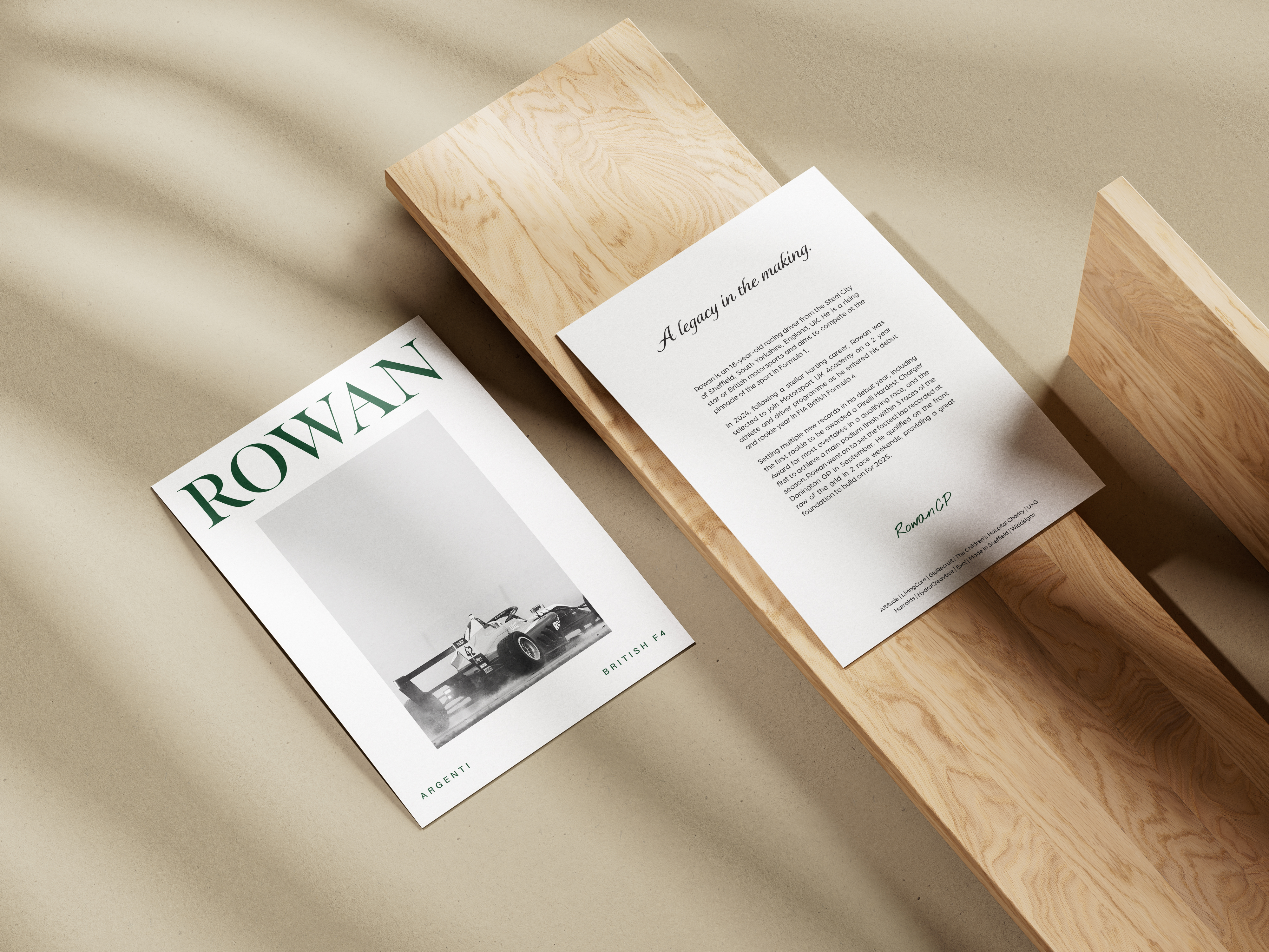
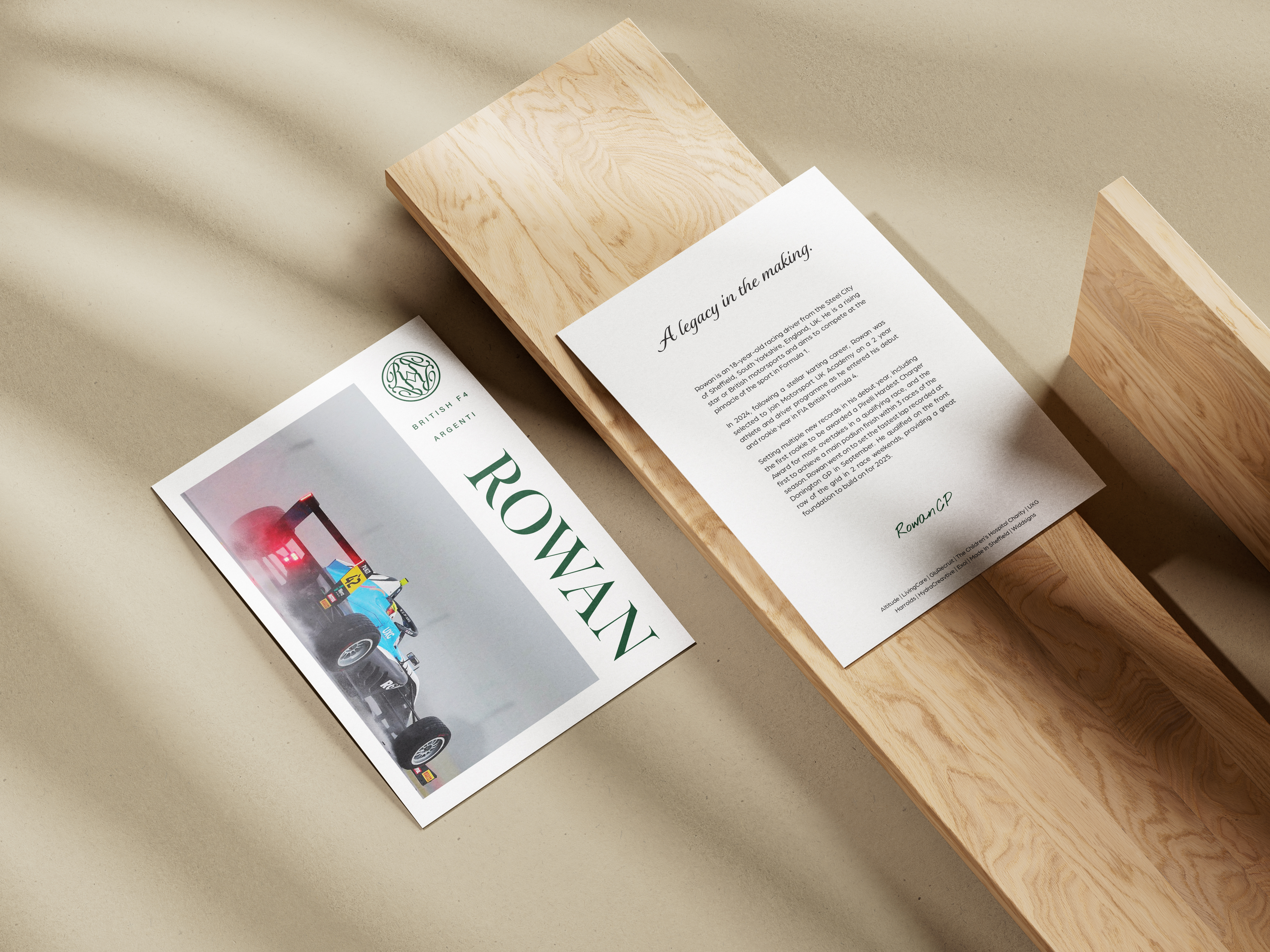
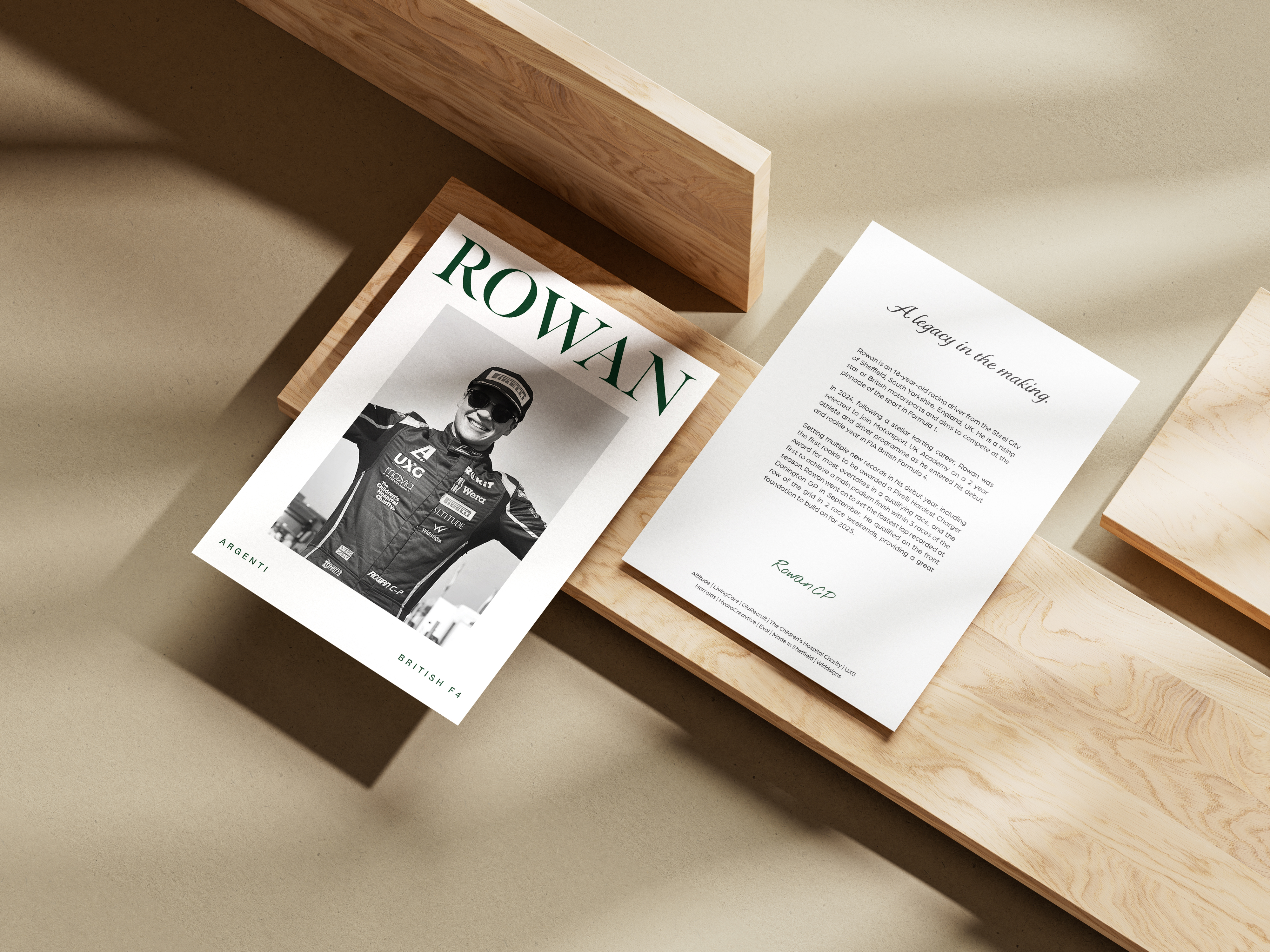
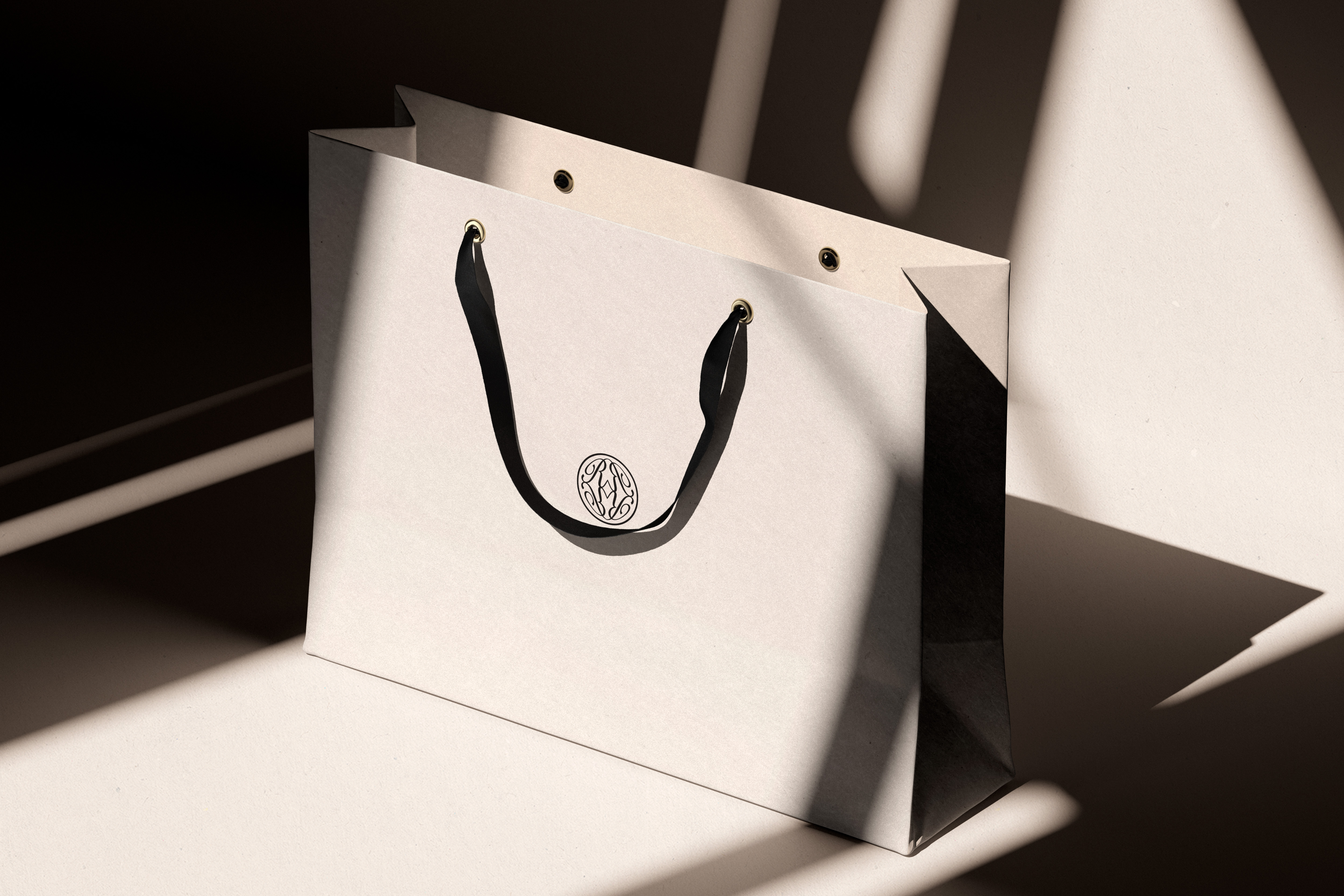
Four driver cards form a collectible series, combining editorial photography with a consistent typographic system. The wider identity extends across a brand book, event invitation, RSVP webpage, gift bag, signage, merchandise and helmet concepts.
Each application uses the same restrained palette, typography and space, allowing the identity to feel recognisable without relying on decorative supporting graphics.
The reveal
A gala-style launch on the shores of Lake Como.
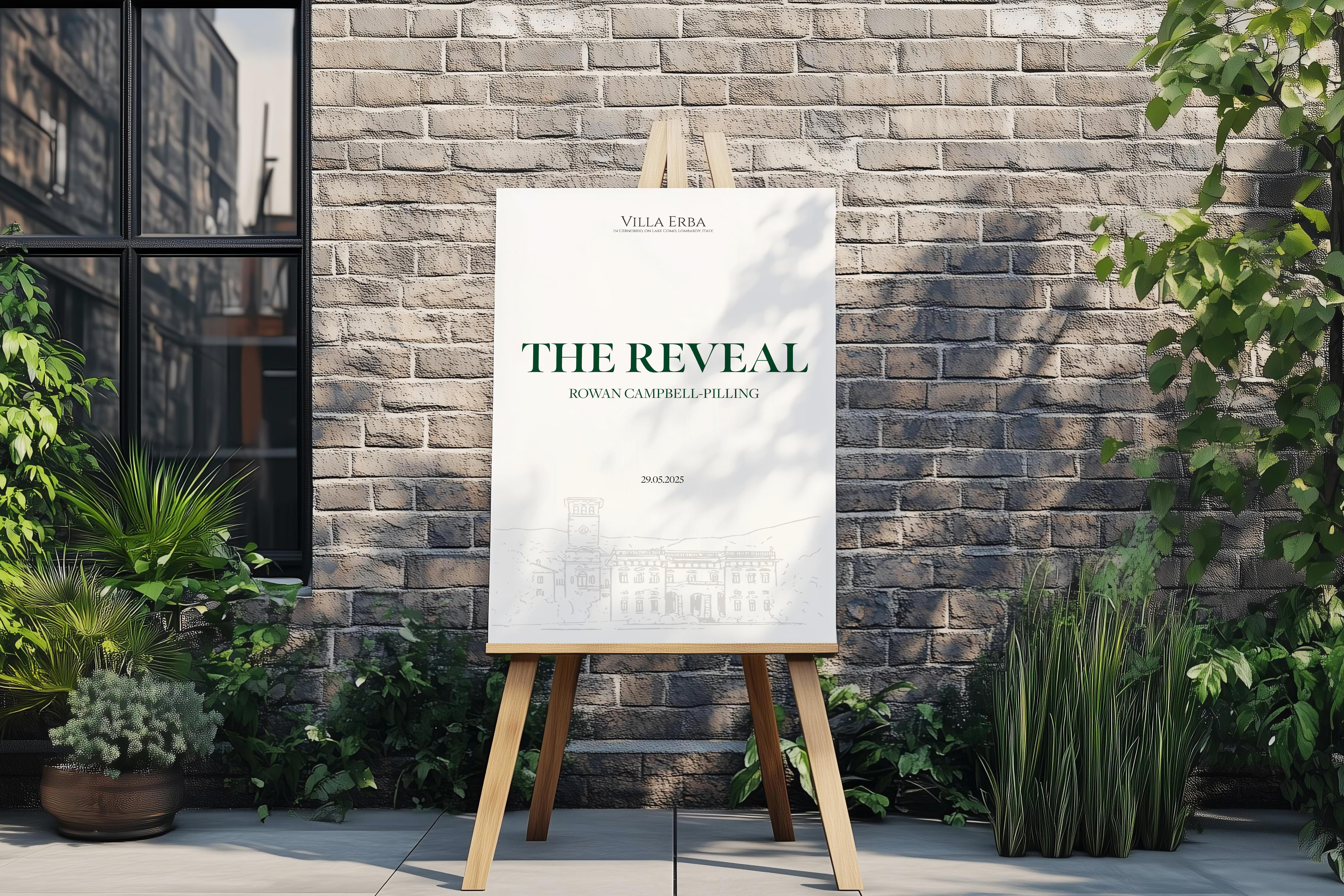
The conceptual reveal imagines the identity launching at Villa Erba in Lake Como, a setting associated with heritage, elegance and automotive culture. It is conceived as a gala-style brand experience inspired by luxury car unveilings, rather than a reveal of the car itself.
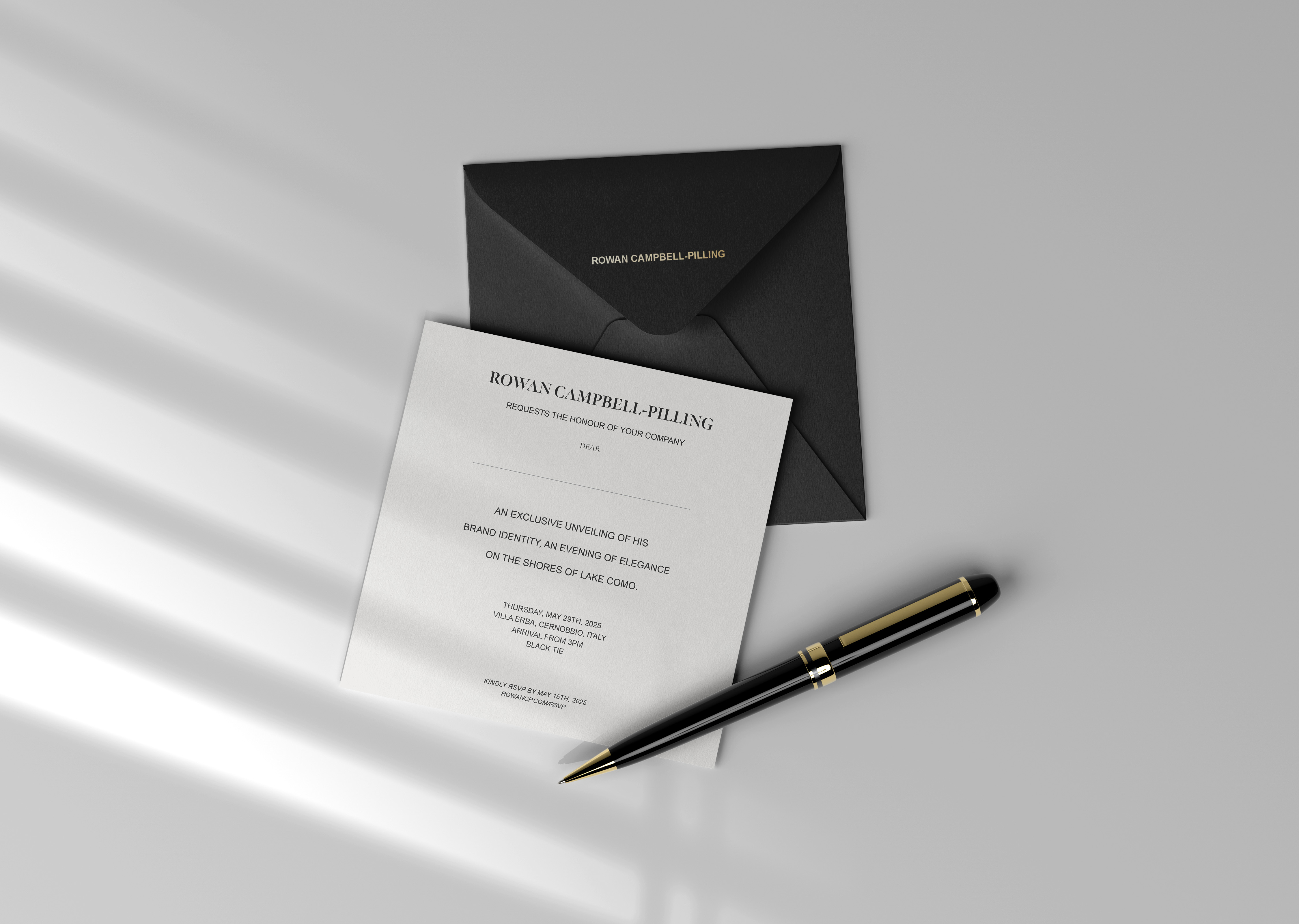
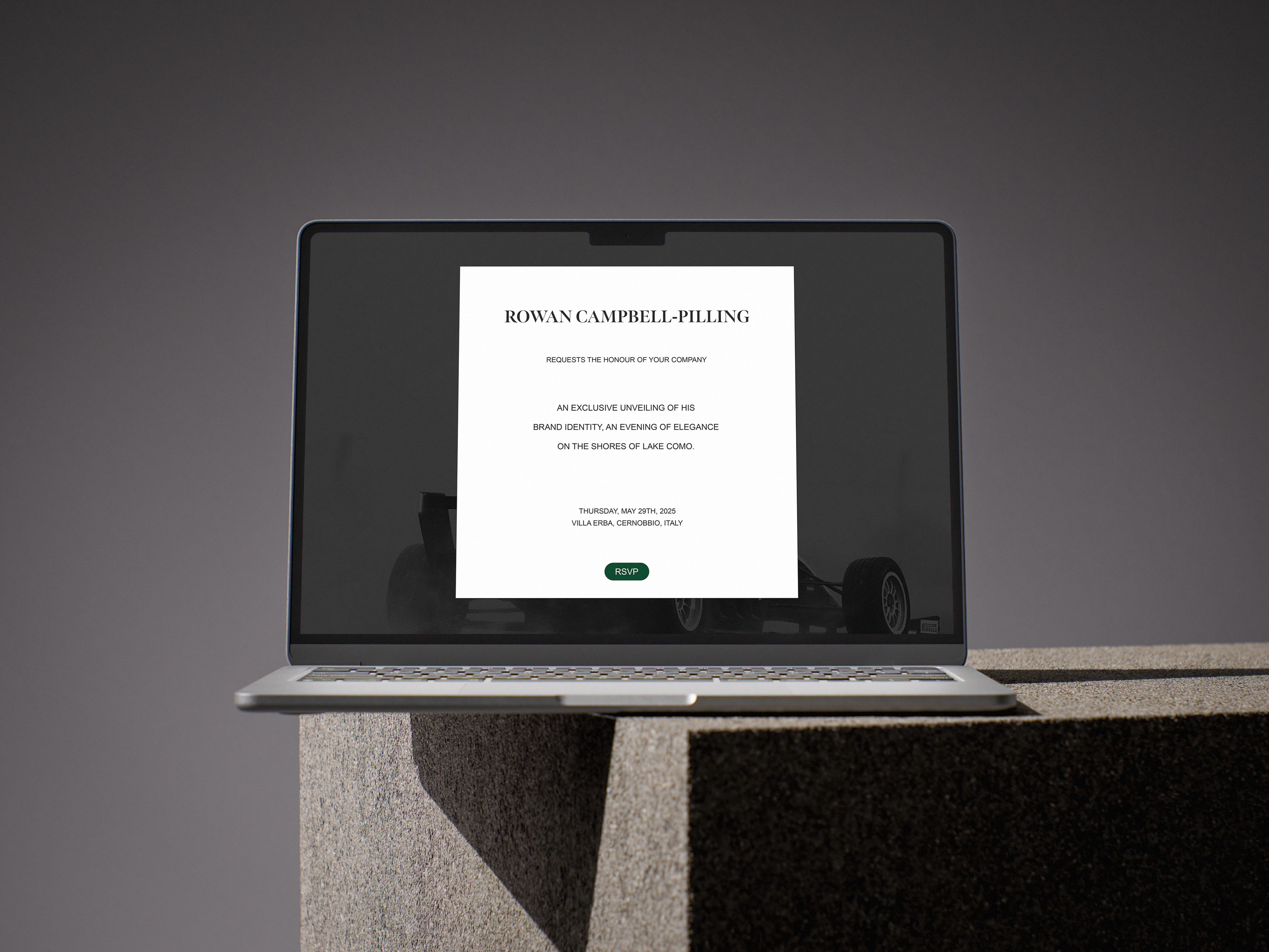
Invitations and the RSVP experience introduce the event before guests encounter branded signage, exhibition spaces and considered gifts. Material ideas including carbon fibre connect to motorsport, while silk and linen bring a more formal, refined quality to clothing and event details.
Purpose
Making space for the causes connected to Rowan’s story.
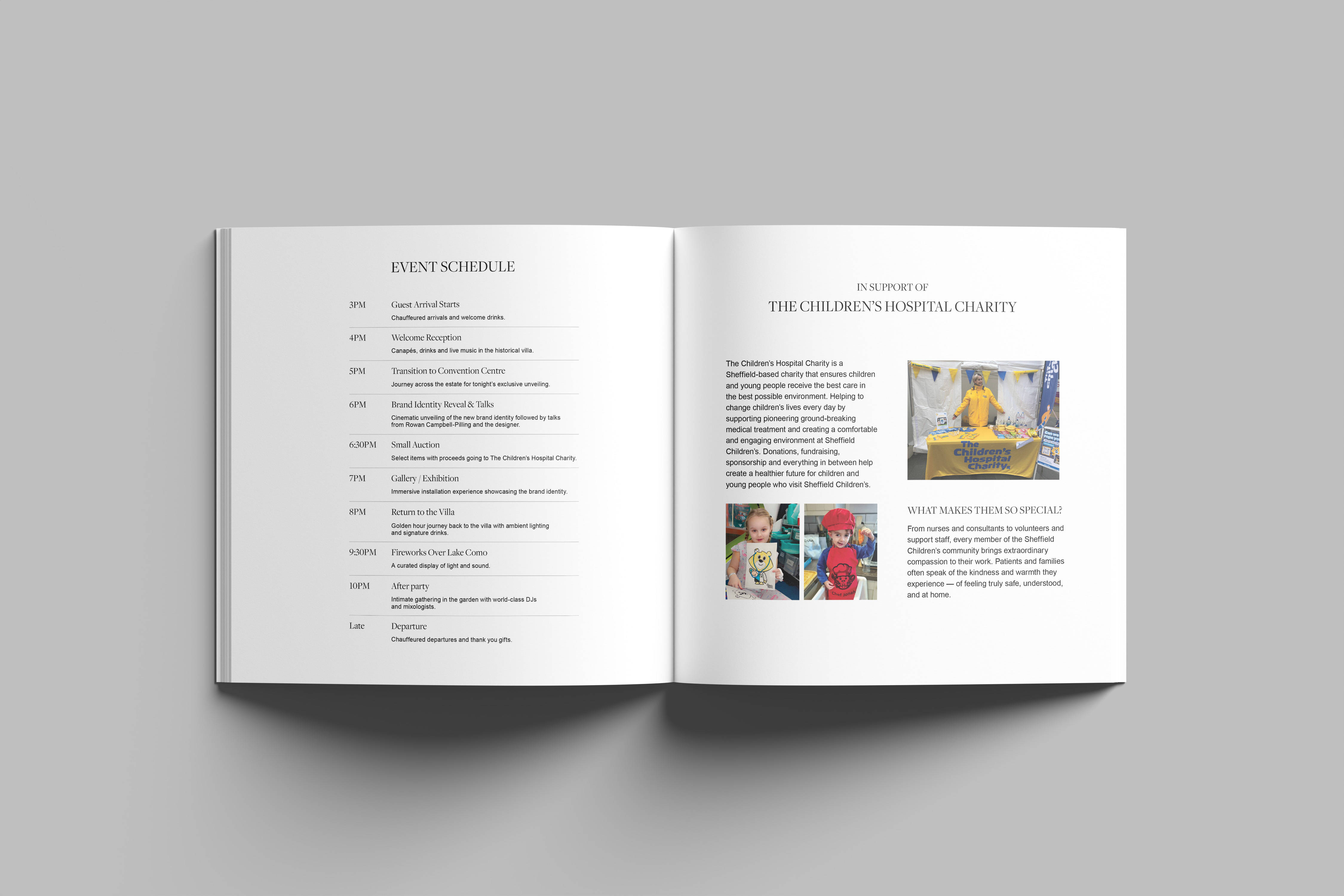
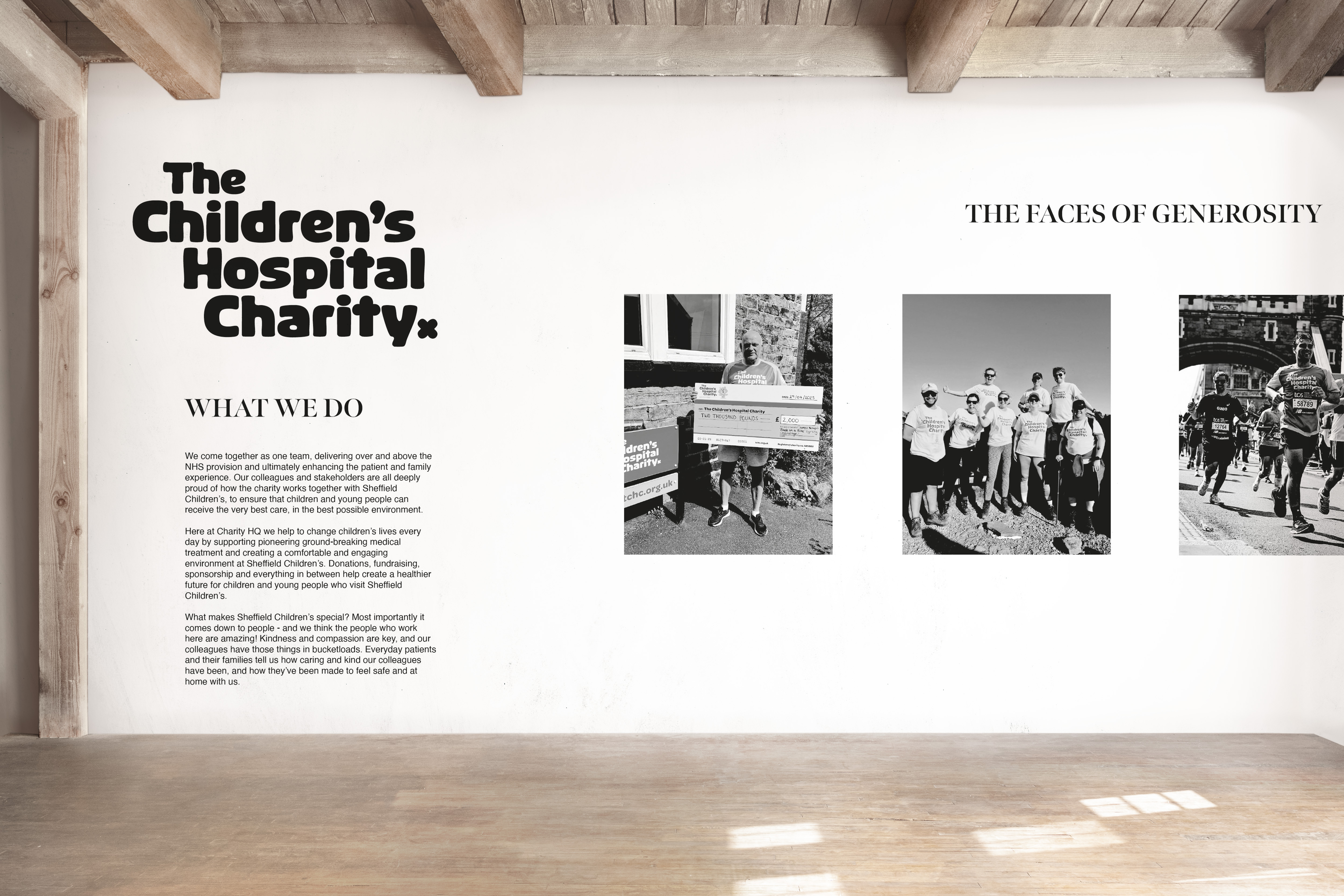
Rowan’s support for Sheffield Children’s Hospital Charity was incorporated into the conceptual exhibition and printed event materials. This gives the reveal a wider sense of purpose while keeping the charity content distinct from the core visual inspiration for the identity.
Conceptual exhibition
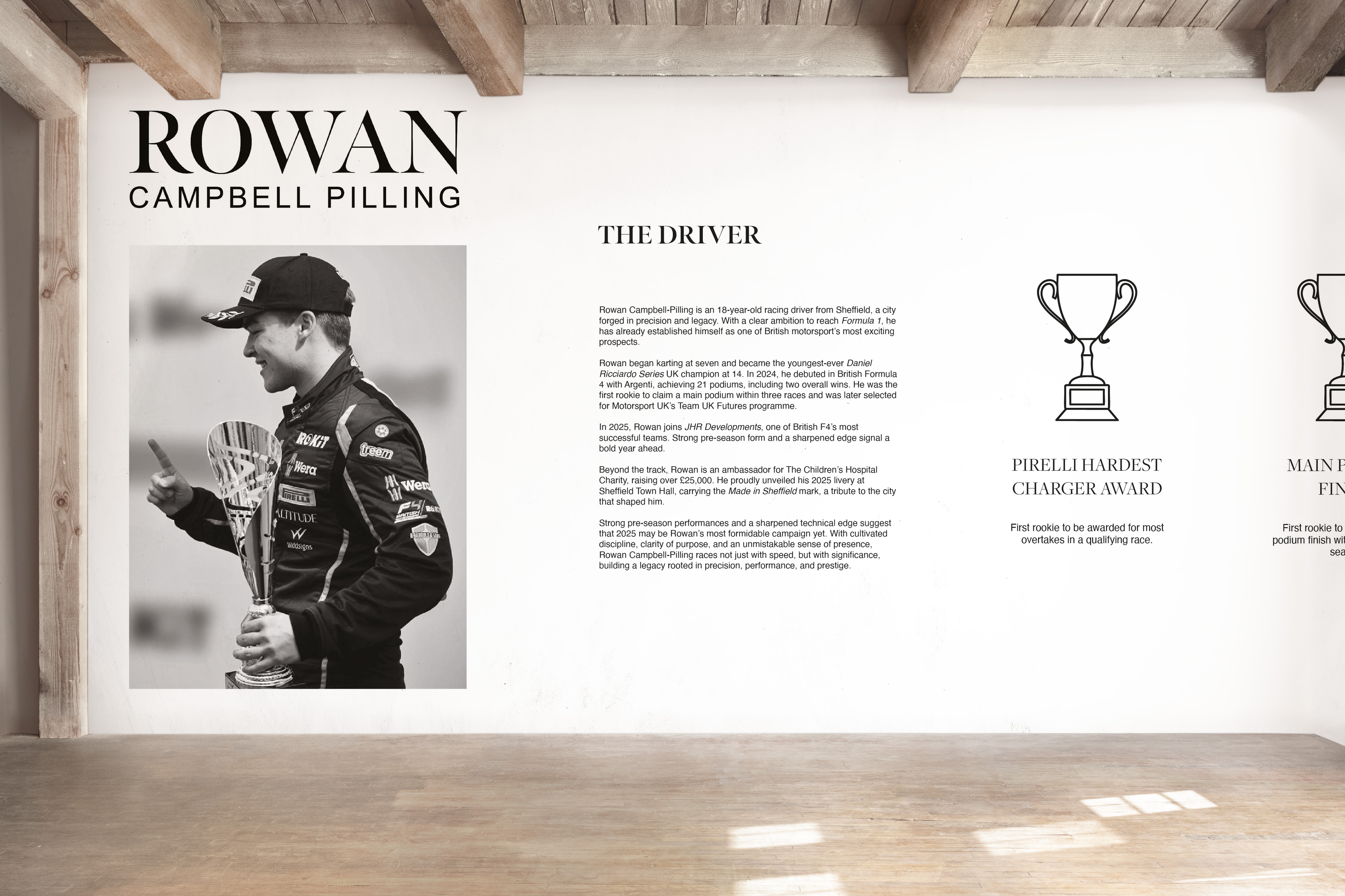
The identity, driver and purpose brought into one space.
01 / 03
Development and reflection
Refinement became the most important part of the process.
Early logo ideas explored wheel forms and the Yorkshire rose. Around ten different directions were tested before the final monogram was selected and refined. The most difficult part was ensuring that the mark felt distinctive and resolved enough to support the breadth of the identity.
The finished project demonstrates how research can shape a visual idea and how that idea can remain coherent across identity, editorial, digital and spatial design. It strengthened my confidence in developing a concept beyond a single outcome and showed the value of continuing to refine rather than settling on the first workable solution.
The brand book
Bringing the complete system together.
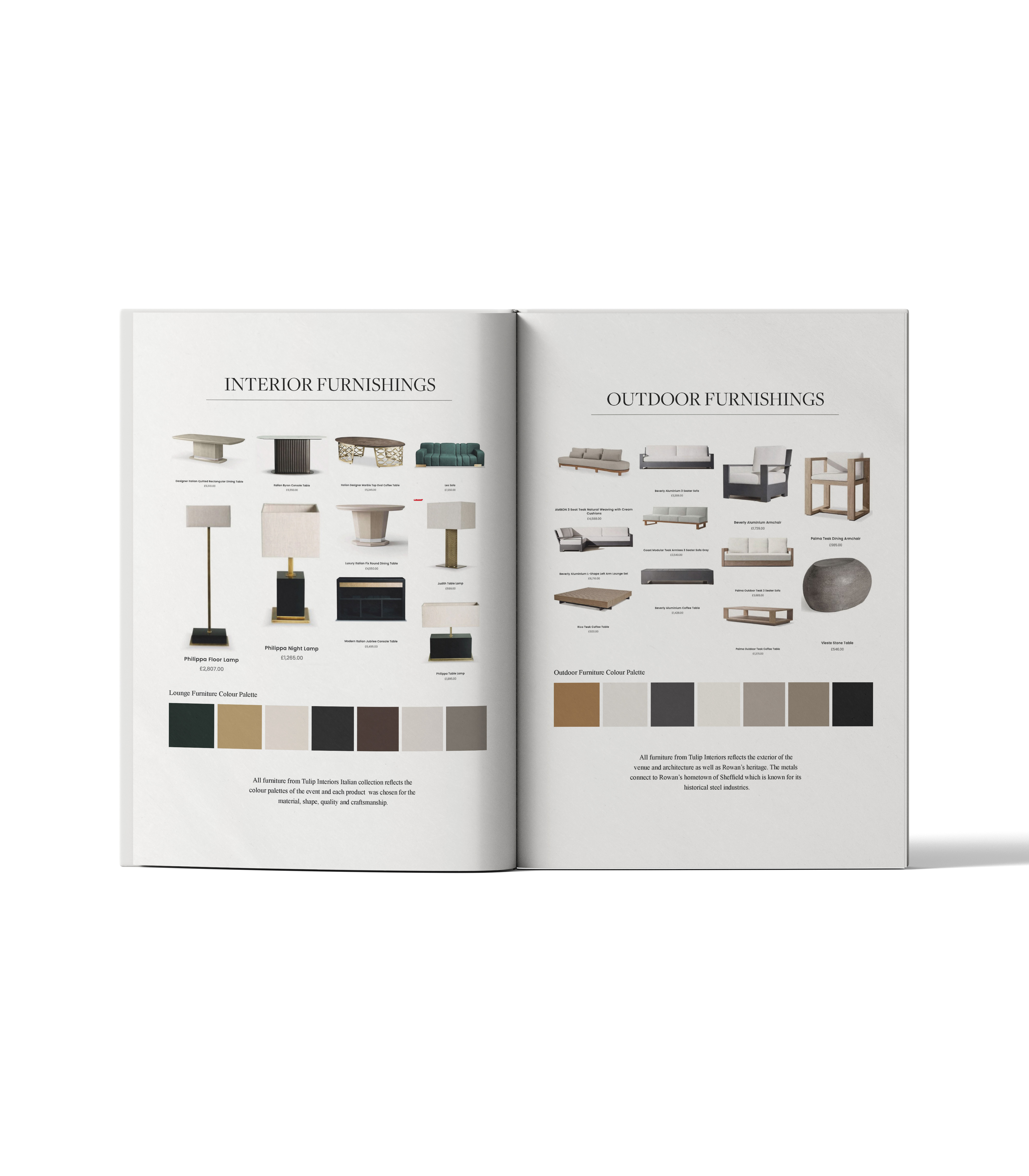
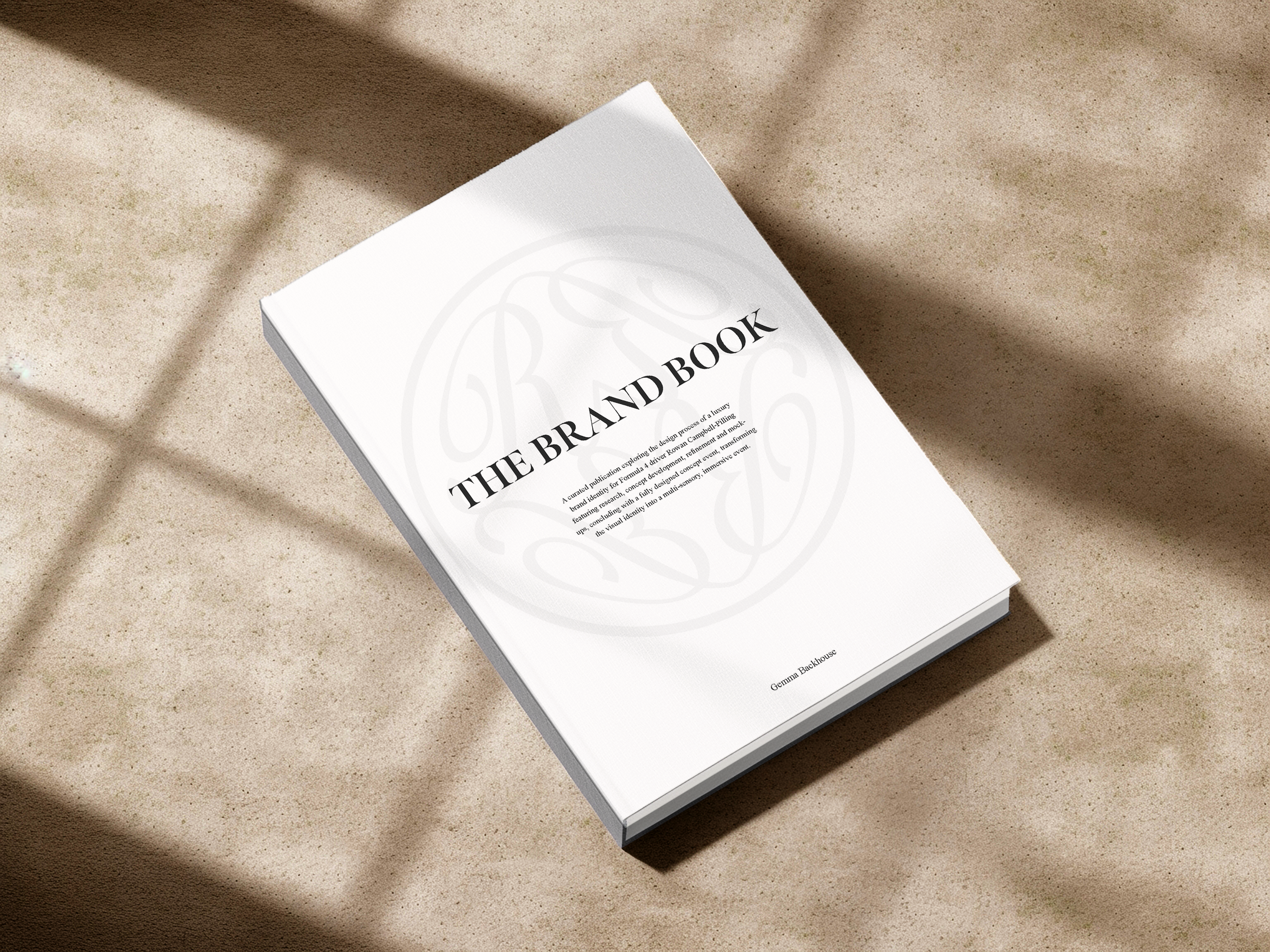
The brand book records the thinking, identity, applications and conceptual reveal as one coherent body of work. It closes the project by showing how the central idea can guide decisions across print, digital, material and spatial design.
Credits
Project concept, research, creative direction and design by Gem Backhouse.
Rowan Campbell-Pilling imagery used with permission. Additional third-party imagery remains the property of its respective owners.